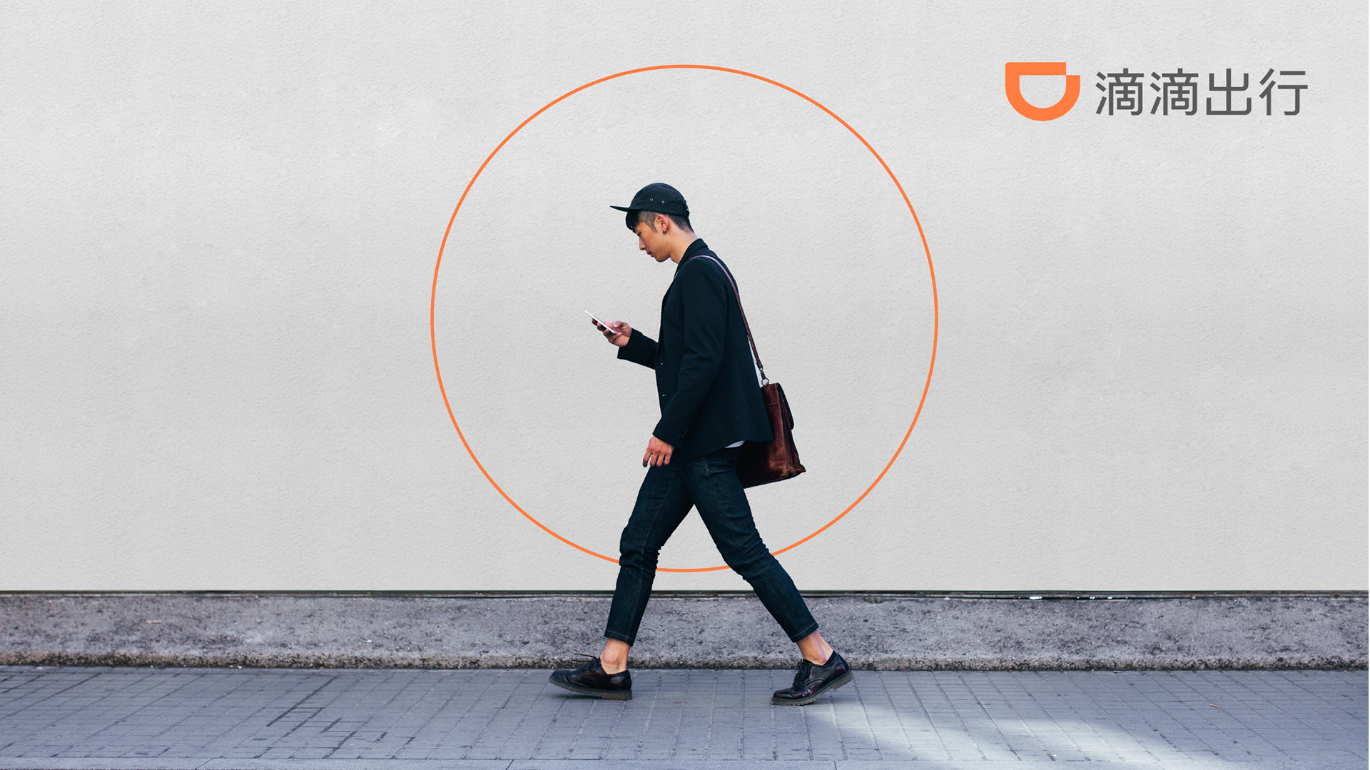
A world-leading mobility platform
Founded in 2012, DiDi Chuxing, or Xiao Ju in Chinese meaning little orange, grew from a taxi-hailing app into one of the largest and fastest-growing intelligent mobility platforms in the world. With more than 550 million users taking 30 million rides per day, it now boasts an ever-growing range of “one-stop” mobility services, ranging from ride hailing and car/bike sharing to rental and after-market services.
My Role
Design Director
Credits
MetaDesign China
The Situation
"We needed a consistent visual structure and distinctive sound brand to achieve “one brand, one voice”.
The company’s stunning growth had outpaced its brand management capacity, resulting in a highly fragmented brand image. DiDi needed a consistent, unified, flexible branding system as it pursued global ambitions.
Simplicity and a Clear Identity
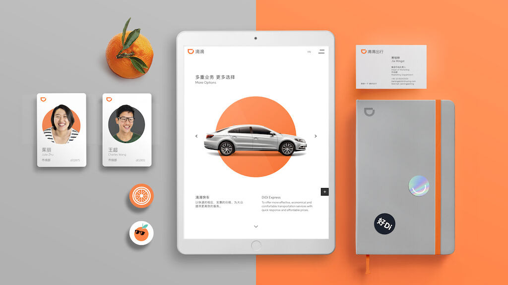
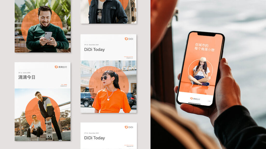
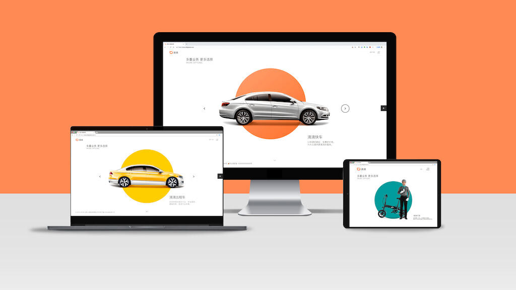
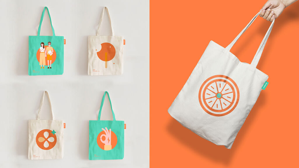
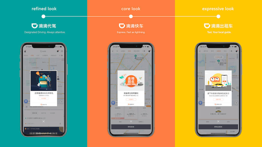
Simplified the brand design based on the concept “More is Less”. Using this approach, we devised a clear brand structure, with distinct color schemes and image styles to identify the Masterbrand and sub-brands services – all while keeping in mind the brand’s origin as a “little orange”. As a result, DiDi’s entire branding framework became clearer, allowing customers to instantly identify different types of services.
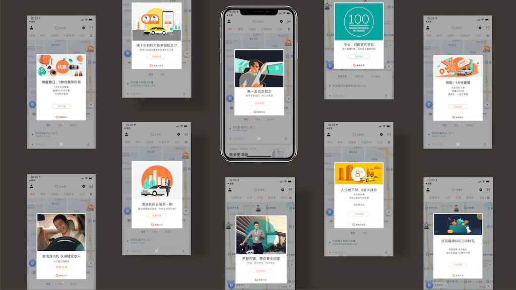
To let customers know when their DiDi is arriving, a custom 2.5 second sound design was created which blends light crisp notes from the glockenspiel, pizzicato strings and whispers “DiDi”. Most importantly, the new identity system was applied to the UI and UX of the DiDi Chuxing app - enabling visual unity and easier, more intuitive use for customers.
In addition to a stronger, more unified brand, this work made their core product – the DiDi Chuxing app - far easier to navigate and use.
What We Did:
- Developed an entirely new logotype for the DiDi master brand
- Designed and streamlined the visual assets for the master brand and different business units/services under it: from fonts to colors, image style to illustrations.
- Consolidated the new identity in a set of clear and easy to use bilingual guidelines
- Developed DiDi sound logo
Our Solution
The brand strategy and identity system unified DiDi’s brand and services during a crucial moment in its business growth, empowering its successful expansion across mainland China and into 6 new markets including Australia, Brazil, Mexico, Japan, Hong Kong and Taiwan. The sound design has since become symbolic for China’s largest ride-hailing app – with the friendly sound heard across more than 400 cities in China 30 million times a day!
The copyright of the material appearing in this article belongs to its legal holder and is only for dissemination and non-commercial use. If your rights are unintentionally violated, please contact me in time.
文中出现的素材版权属于其合法持有人,仅供传播使用,非商业用途。如无意侵犯到您的权益,请及时联系我处理。